Top Color Trends for 2021: Natural Palettes & Vibrant Pops of Color
May 16, 2022In 2020, we rediscovered our love for nature and have invested in our homes to be inspiring, invigorating, and relaxing places to live, work, and play. These lessons are reflected throughout color trends you can expect to see in 2021. Next year’s color trends are grounded in what we’ve all been craving this year — comfort, nature, and personalization.
Color palettes rooted in nature
Nature is never far away, and the continued biophilia trend proves that. Biophilia is the practice of incorporating nature in your home. We’ve seen this trend thrive in outdoor spaces this fall and expect it to be used throughout the home in 2021 by using warm, rich, and moody colors.
Read also: 7 Outdoor Living Trends We’re Loving This Fall
These colors convey a sense of coziness, comfort, and safety while inspiring connection and encouraging you to unplug and be present in the moment.
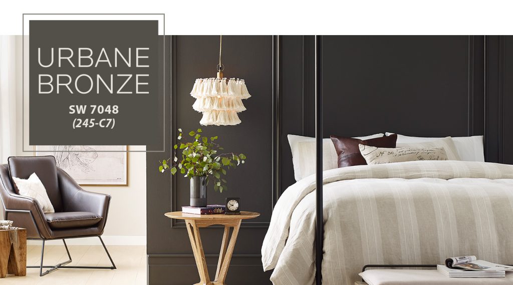
Sherwin-Williams’ 2021 Color of the Year
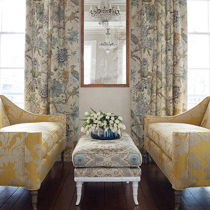
These feelings can be seen in Sherwin-Williams’ color of the year: Urbane Bronze. It’s a warm and sophisticated bronze that’s rooted in nature and inspires us to find sanctuary. It also has the unique ability to ground a room through organic appeal.
This warm hue draws from nature to create a feeling of relaxation and serenity, so you can use it wherever and however you want — from accentuating window trims to accent walls. It also works well with other biophilic elements you may have already included in your home, like light-filled spaces and foliage.
We love pairing Urbane Bronze with a variety of window coverings! If you’ve painted a room with this color, we recommend choosing a warm neutral color or a bone white for your fabric and pairing it with dark and bold accents to create a moodier room. You can do this by adding a velvet leading edge that pops against the dark paint and pairing your window treatments with brass or brushed nickel hardware.
Then, complete the look with other natural materials, like wood finishes, stone accents, and mixed metals to tie this earthy neutral back to its nature-inspired roots.
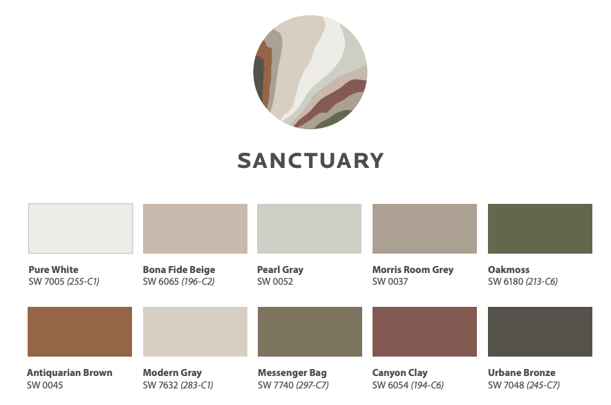
Color palette highlight: Sanctuary
If you want some inspiration for how to include nature in your window treatments, look no further than the color palette “Sanctuary.” This palette includes calming beige and grays with muted warm tones to create a space that helps you unwind.
Read also: Color Trend Report: Is Gray Out of Style?
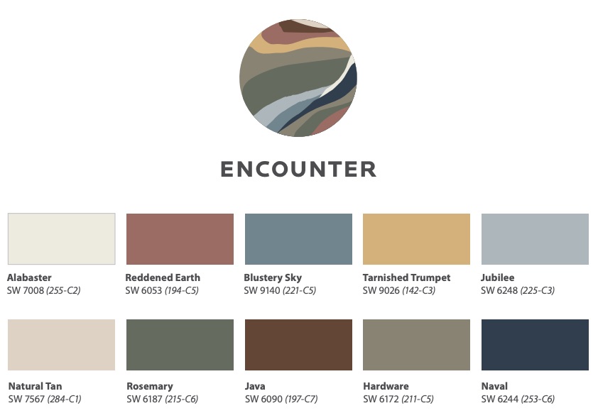
Color palette highlight: Encounter
Another palette you can use to embrace the biophilia trend is “Encounter.” These rich and muted earth tones are meant to evoke a story about craft and creativity. They also remind us where we’ve been and reflect on where we’re going. Because of this, Encounter is a blend of contemporary and traditional, making it the perfect palette for anyone who loves the transitional design style.
Read also: Chattanooga’s Most Common Interior Design Style: Transitional
Vibrant & energetic colors
In 2021, we also expect to see the use of pops of bright colors to create moments of cheerfulness in your home. We’ve seen this resurgence of rich, saturated hues lately because they create an energizing space. So, don’t be afraid to create interiors that are lavishly swathed in color.
These rich, evocative colors create a visually stimulating home that will instantly lift the mood in any space.
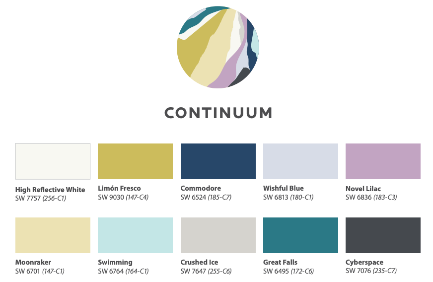
Color palette highlight: Continuum
We love using the color palette “Continuum” in homes. This palette takes the concept of living with technology and using it to inspire your home’s design. When you think of technology, you may think of gray hues and modern flair. Continuum adds pops of color, though, to create flow and movement throughout your home.
We’ve always loved combining technology with color by layering motorized shades with colorful cornices or drapery panels. By using layered window coverings, you can add additional functionality and make a huge style statement by using rich, vibrant colors.
Motorized shades greatly simplify your life by allowing you to open and close them automatically. When they’re fully open, the shades will be hidden behind a cornice or with low-profile cassettes that blend seamlessly into your window trim.
Just like the color palette Continuum, layering soft finishing with motorized shades is the perfect way to use technology to inspire your design while adding a pop of color. It’s both innovative and optimistic.